
|


|
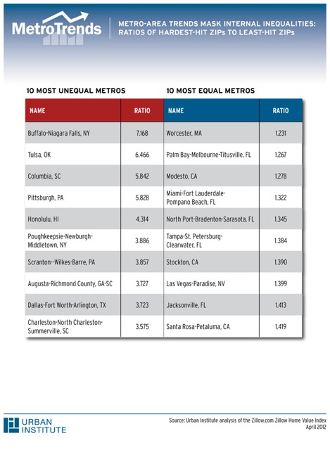
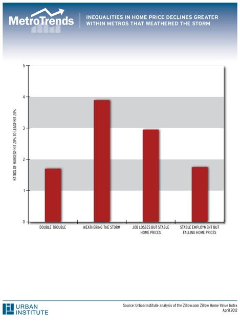
Neighborhood House Price Declines In a Housing Crash, Not All Neighborhoods Within Metros Hit the BottomIt is common knowledge that the housing market crash hit some metropolitan areas harder than others. Metros that did not experience huge run-ups in home prices and metros with relatively stable labor markets were more likely to avoid the massive declines in home values suffered by other metros. We know far less, however, about what happened in different neighborhoods within metros. To explore this issue, we measure the peak-to-trough percentage decline in home prices through December 2010 for each ZIP code within the top 100 metros using Zillow.com's Zillow Home Value Indices. Nationwide, prices within a ZIP code fell by around 30 percent from their peak to their trough. The hardest-hit ZIPs - the bottom 10 percent nationwide, like the average ZIP in hard-hit Santa Rosa, CA - fell by over 40 percent. The relatively unscathed ZIPs - the top 10 percent nationwide, like the average ZIP in Columbia, SC - fell by only around 18 percent. Looking within metros, we take the percentage declines in home prices for the hardest-hit (10th percentile of the distribution) and the relatively-unscathed (90th percentile of the distribution) ZIP codes, and calculate the ratio of the two averages. This resulting ratio tells us how much worse the hardest-hit ZIPs fared. For example, a ratio of 2 means that percent price declines in the worst-hit ZIP were twice as large as price declines in the least-hit ZIP. In most metros, the worst-hit ZIPs experienced much more severe declines in housing values than the least-hit ZIPs. Across metros, on average the worst-hit ZIP experienced percentage price declines on the order of two-and-a-half times greater than the least-hit ZIP. Among the most equal metros, Santa Rosa's worst-hit ZIP had price declines that were 40 percent greater than in the least-hit ZIP (for a worst-least ratio of 1.4). Among the most unequal metros, Columbia's worst-hit ZIP had price declines almost 6 times as large as in the least-hit ZIP (for a worst-least ratio of 5.8). In metros where peak-to-trough house price declines overall were more severe, the least-hit ZIPs did almost as badly as the worst-hit ZIPs. A 2011 MetroTrends commentary highlighted the differences between metros that suffered "double trouble" (above-average declines in both home prices and jobs) and metros that were "weathering the storm" (below-average declines in both home prices and jobs). In "double trouble" metros, and metros with falling home prices and stable employment, the average ratios were around 1.7. Even though the hardest-hit ZIPs in metros that had less of a housing bust did better than the hardest-hit ZIPs in the worst-off metros, metro areas with the best performing housing markets experienced greater disparities within their borders. For metros where home prices held steady but job losses were higher than average, the worst-hit/least-hit ratio was 2.9, while the "weathering the storm" metros' worst-hit ZIPs had price declines almost 4 times those of the least-hit ZIPs. Some of the differences in price declines within metros may be due to differences between expensive areas and less-expensive areas. Zillow.com documented this in 2009, although the evidence was more mixed using data in 2010. Comparing ZIPs with less expensive housing (20th percentile of the price distribution in September 2006, a high point for housing values nationwide) to more expensive ZIPs (80th percentile), less expensive ZIPs experienced larger price declines than more expensive ZIPs in most metros. On average, less expensive ZIPs experienced price declines that were one-third larger than more expensive ZIPs within the same metro.Clearly, the story of the housing crash is a local story. Relatively lower-priced areas within metros took a harder hit than more expensive areas, even in metros where the housing crash was not as severe overall. Policymakers in these metros may need to take a look at their hardest-hit neighborhoods, which may still need help even as conditions in the metro area overall improve. Notes on the Zillow Home Value Index:Information on how these price indices are derived is available at http://www.zillow.com/blog/research/2012/01/21/zillow-home-value-index-methodology/. ZIP-code level ZHVIs are unavailable for 15 of the top 100 metro areas, and are available for less than half of the ZIP codes within the metro area in the third quarter of 2006 - the peak of the market as defined in MetroTrends' "Double Trouble" commentary - for an additional 10 metros. For ZIP codes, peak-to-trough declines are estimated between each ZIP code's highest recorded and lowest recorded price level during the boom through December 2010. For metro areas, peak-to-trough declines are estimated using the market peak measured in the third quarter of 2006 and the market trough measured in the third quarter of 2009. |
Experts
Feedback
Send us your comments to help further the discussion. Share
Commentaries
|

 Claudia Sharygin